Nectar
Nectar is a platform through which advertisers and publishers make a deal for ad inventory. The publisher user group provide advertising inventory for purchase, while the ad operation user group buy the ad space to run their ad campaigns.
History
Nectar’s initial design was handed off by a design agency, and has since been without a designer. There were a lot of usability problems to be fixed when I came onboard as the in-house product designer.
The redesign project initially came about from wanting to make Nectar responsive. The challenge was to make the entire site responsive incrementally by breaking up the product feature by feature. Therefore, redesign needed to respect the existing structure and be able to launch one feature at a time.
Discovery
User interviews were conducted with Nectar’s users to discover how they currently use the product, and what their needs and pain points were. There were two main objectives to the discovery phase:
- Understand the current user flow beyond just the usage of Nectar - what do they need to complete their tasks?
- What do the users need from the mobile version of Nectar?
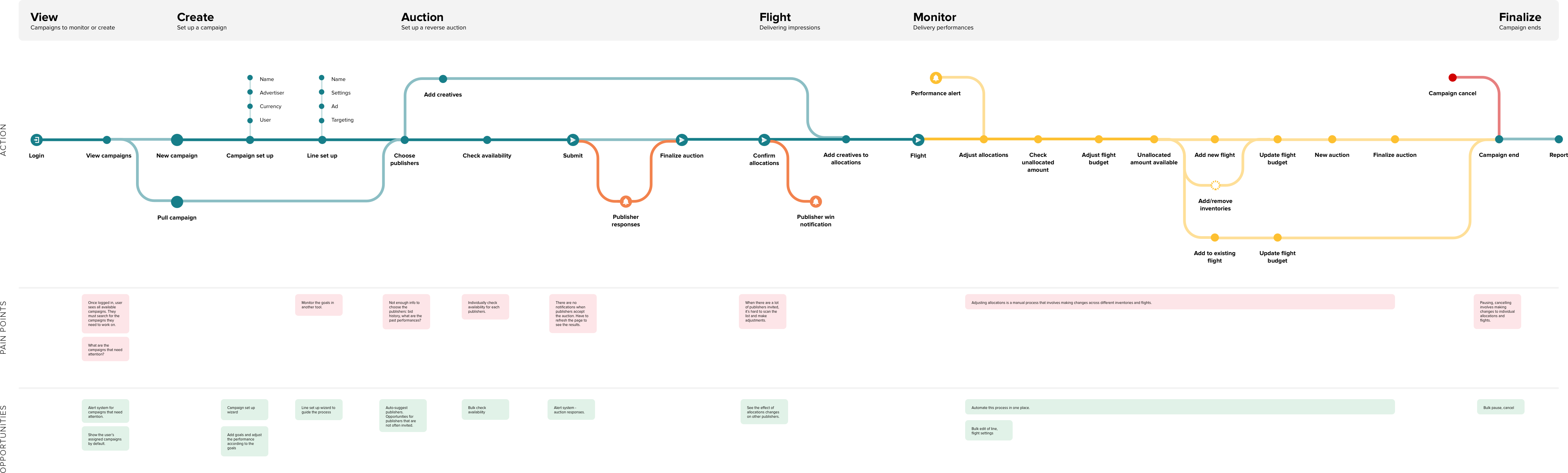
We found that:
- Several different tools were used to track campaign performances.
- Users needed to get data from Tableau to know which campaigns needed attention.
- Even within Nectar itself, you will have to jump between different pages to obtain the performance metrics you need.
- Users had to do manual calculations to maintain the campaign performances.
- When the user had to make campaign adjustments, it could be a very laborious experience to update many different inventories.
- The current navigation system confused the user and the layout could be optimized to quickly scan and find the info they need.
Users rarely accessed Nectar on mobile since they knew that it was not responsive. When they did access it, it was to track the campaign performances. Then they would switch to desktop in order to make adjustments to their campaigns.
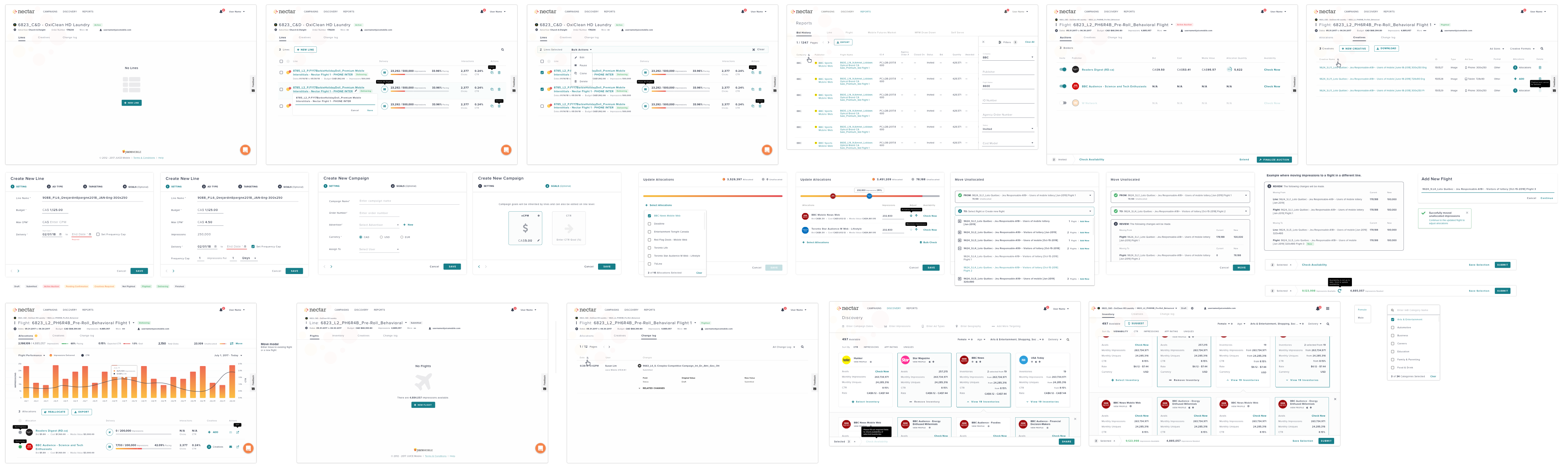
Explore
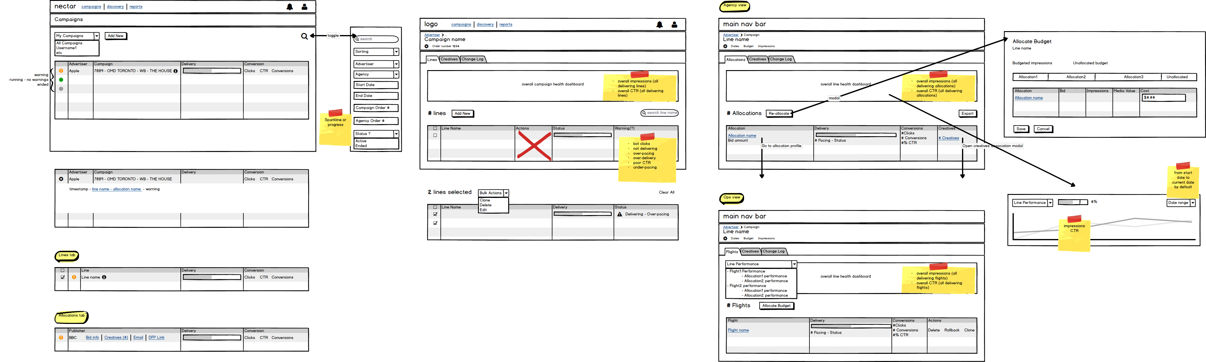
Through sketches and lo-fi wireframes, various ideas were explored. The concept was then further refined through hi-fi versions.
Campaigns
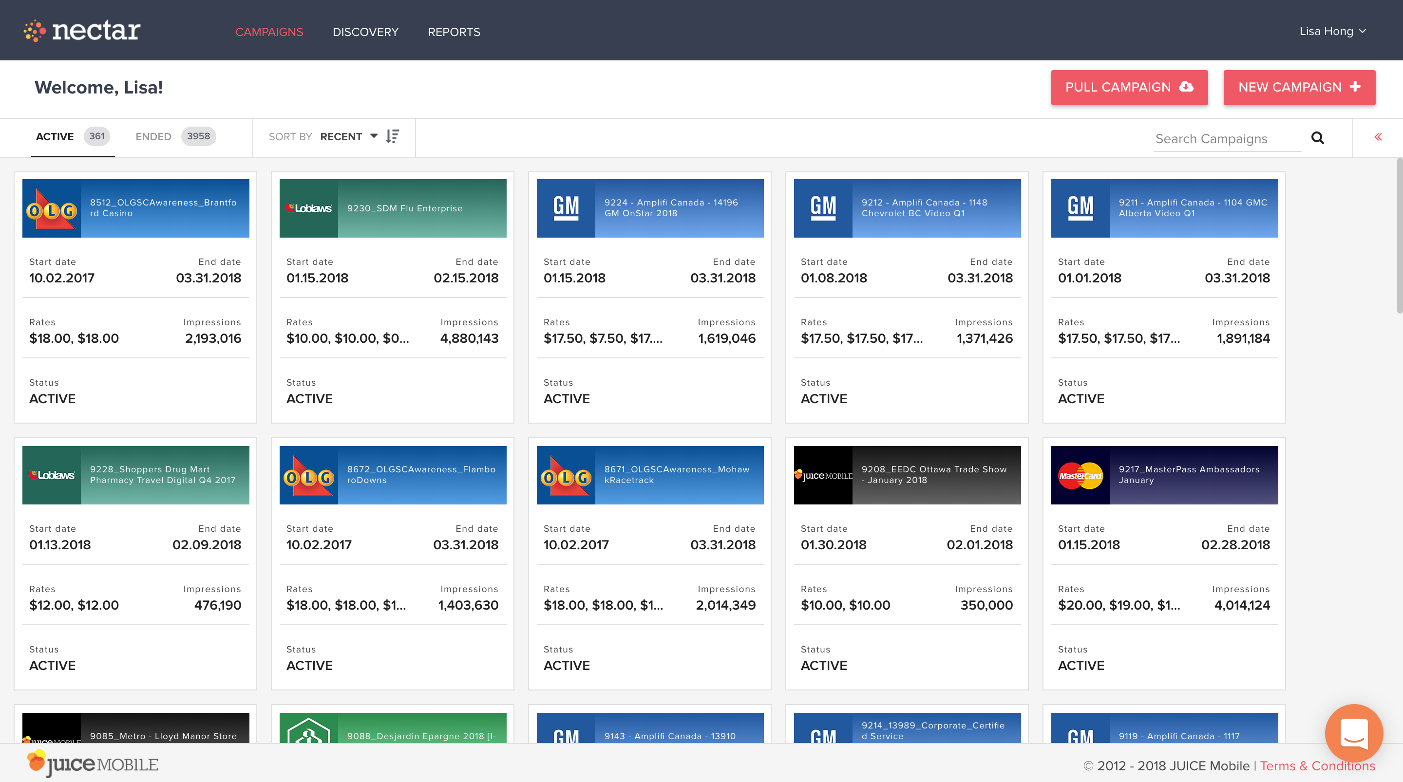
Current campaign page shows campaigns in card format and there is no indication of how the campaigns are performing. Another issue with the page was that it displays all of the campaigns. When the ad ops users login, the first thing they do is to go the search bar to find the campaign they need. What if the home page could display the campaign they need, and inform them of what they need to do?
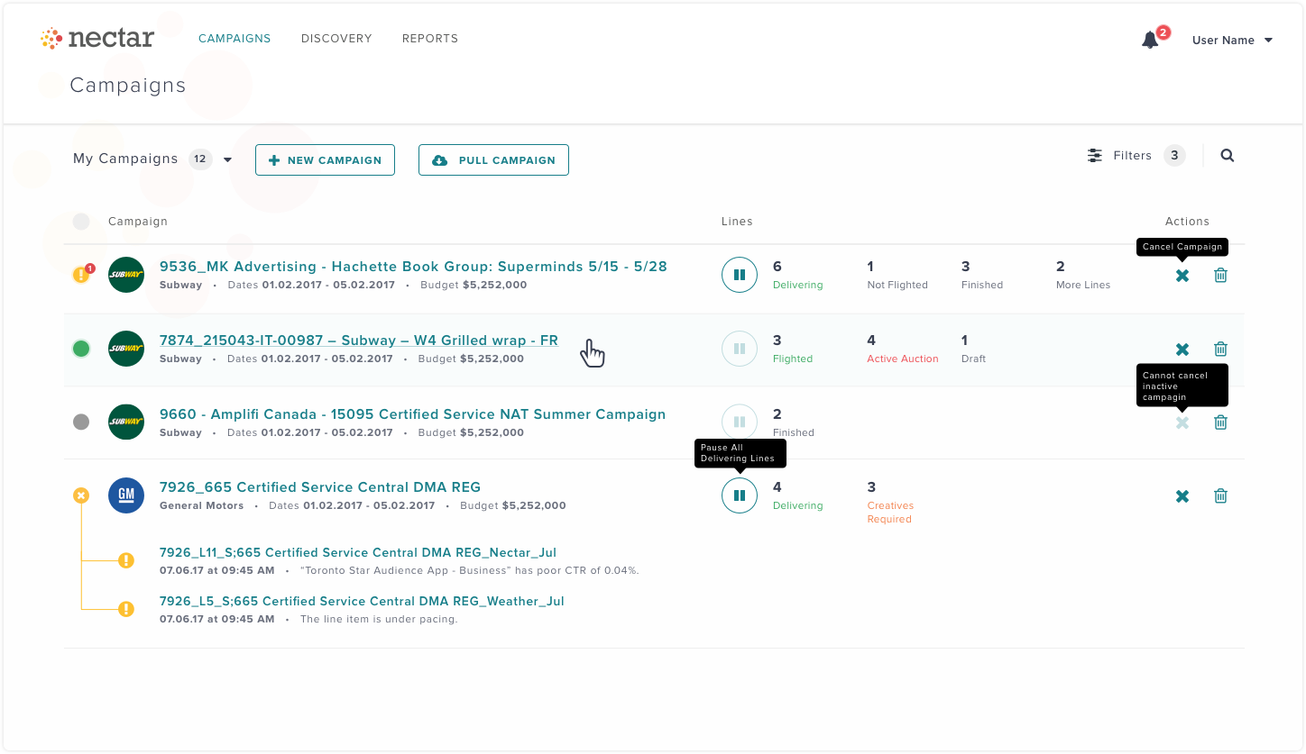
The new design switched to a tabular format so that the info they need could be quickly scanned. Instead of just showing the status as active or inactive, there is a quick visual indicator of campaign health and what exactly needed their attention. The goal was to eliminate the users' needs to use different tools and products to source the campaign performance metrics.
Other new features include:
- Assigned user filter enables the user to see their own campaigns when they’re logged in.
- Being able to bulk pause, cancel and archive campaigns.
Campaign Delivery
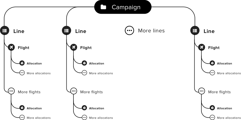
A campaign is organized into different lines and flights.
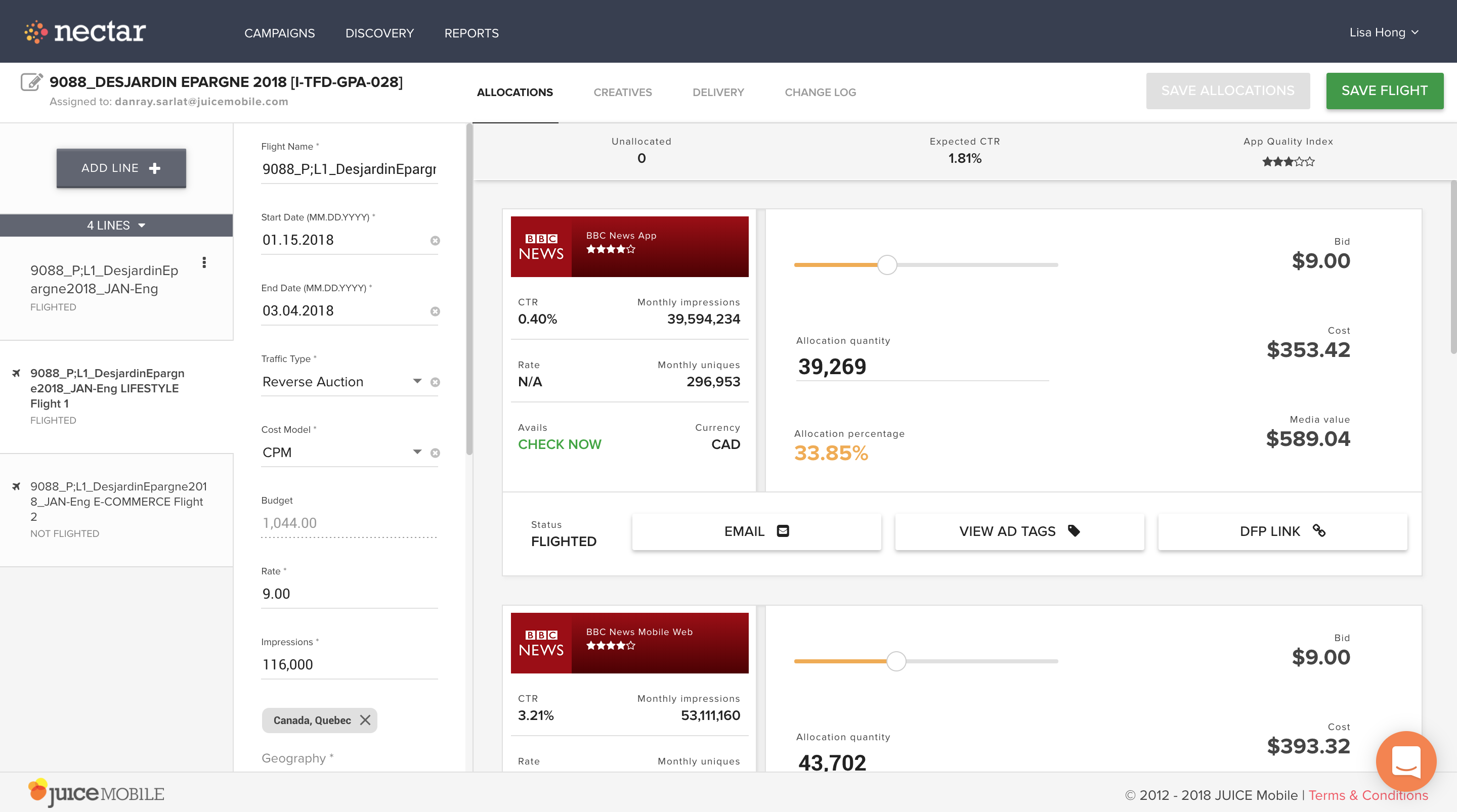
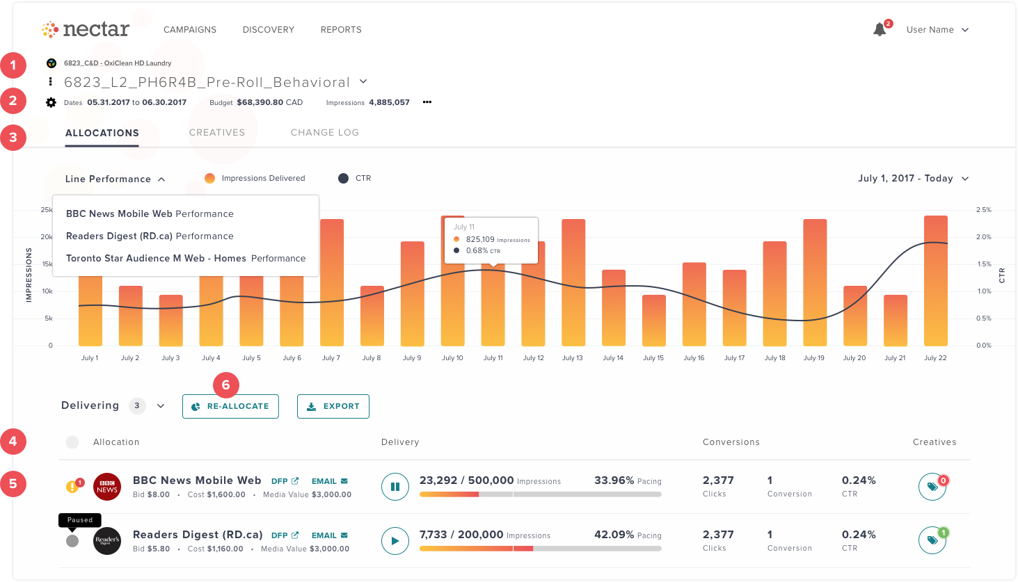
When a line item's flight starts to deliver ads, performance metrics are tracked under “Delivery” tab inside each flight. Users have to switch between “Delivery” and “Allocations” tabs and do manual calculations to make impression delivery adjustments in the flight.
- The navigation system moved to the page title area, where breadcrumb and dropdown menu will be used to navigate inside a campaign.
- The line criteria also moved to the header area, below the navigation system. Users did not always need this to be open and editable, and this took up a large amount of space. It is now displayed more compactly to only show what the user wanted to see to carry out their tasks - budget and dates.
- The “Delivery” and “Allocations” tabs were now combined into a single page. Day to day performance graphs keep track of the most important campaign KPI’s - impression delivery and clickthrough rates (CTR). Now users will be able to see if the performance is consistent and make adjustments as needed.
- There is now a visual indicator of overall health of allocation deliveries.
- Allocations are now displayed in tabular format for quicker scanning of delivery progress. The current layout can only display one or two allocations at a time and it can be labour intensive to scroll and compare them.
- Making allocation adjustments has become a function of its own. Currently, the user accomplishes this by making changes to each allocation separately and calculating the re-allocated amounts. This will be redesigned so that it can be accomplished in one place.
Design system
Nectar was currently using three different frameworks and styles - Twitter Bootstrap, Angular Material and Nectar’s own brand styles. With this redesign effort, I wanted to take stock of current UI state and build a design system that would make the platform consistent and become responsive as well.
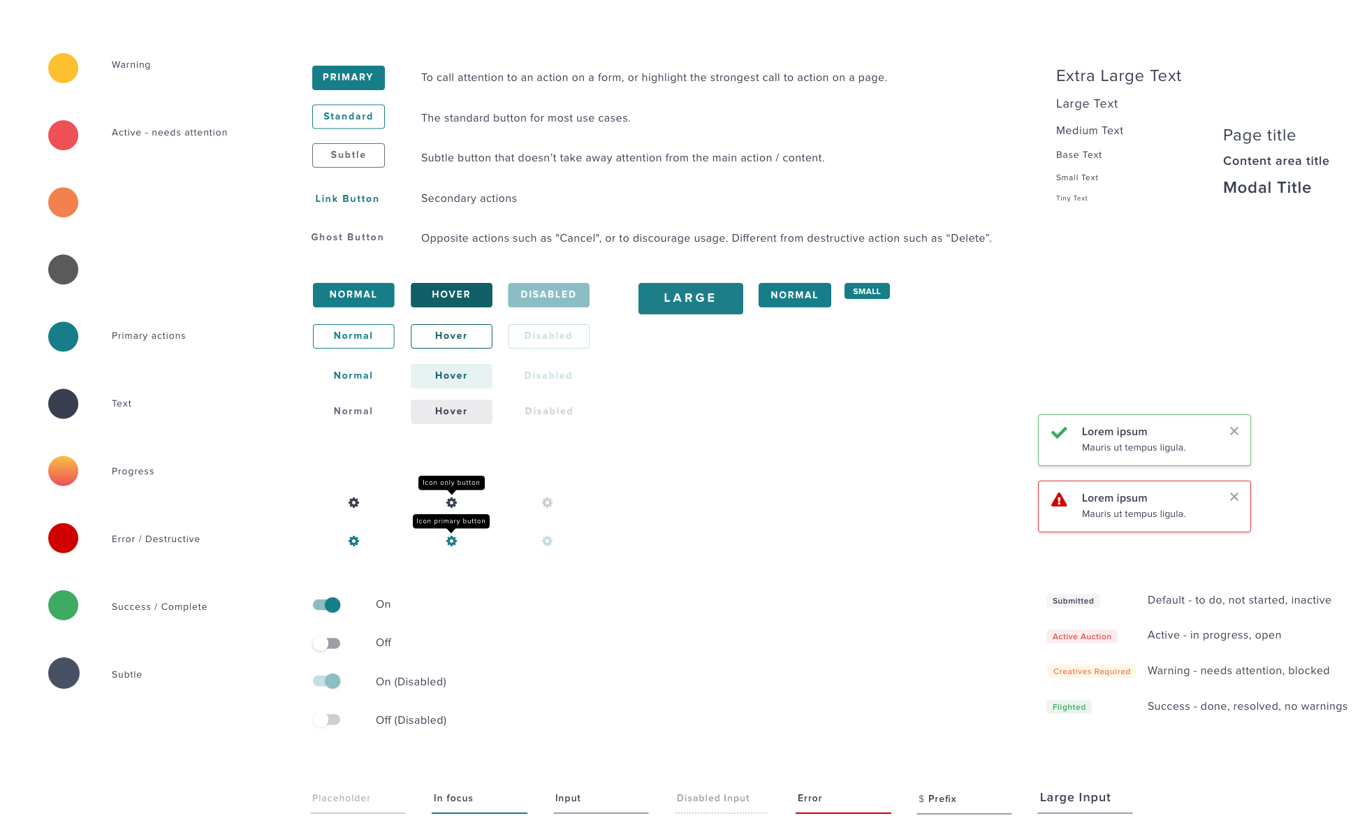
Initial visual exploration used Nectar’s pink brand colour. However, as I progressed through the designs, I realized I had to shift away from the pink as the main primary colour. Interviews and guerilla user testing revealed that many users called the brand pink “red”, often associated with “dangerous” actions. Since I wanted to reserve red and green colours for reinforcing positive and negative actions, different primary colour was chosen to complement the brand colours.
Simplify
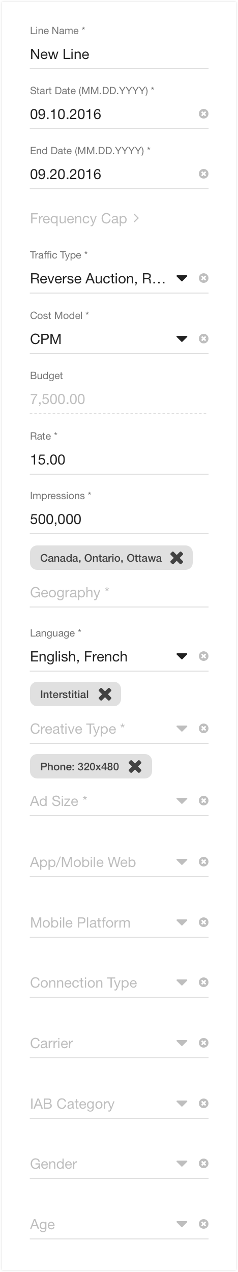 In current state, the line criteria is a single long column. There is no hierarchy and not all fields are mandatory. The dependency between some fields were not evident.
The criteria was broken down into what purpose they serve, and in the order of user tasks.
- General setting of the campaign
- What type of ads
- Audience targeting
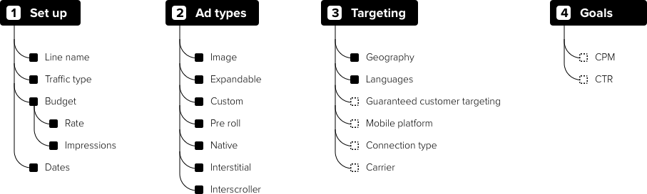
Another potential step was explored for future features that could optimize the performance based on the goals.
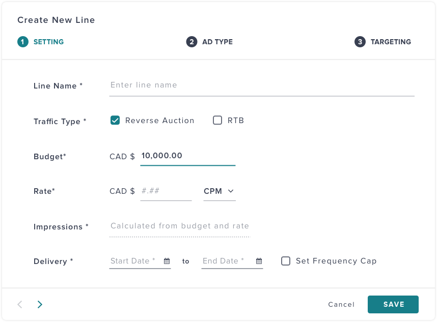
The very first step are the very basics of a campaign, such as the budget and dates. I have attempted to clean up and make the form more accessible by turning some of the dropdowns of 2-4 items into checkboxes or radio buttons. Users will be able to immediately see the available choices, instead of having to click the dropdown.
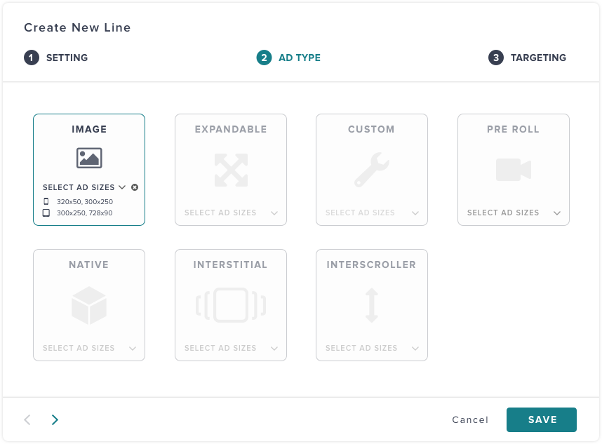
Ad sizes were confusing in its original design. You needed to choose ad type first, and then see the ad sizes. If you have chosen more than one ad type, you wouldn't know which ad size goes with which ad type. This was redesigned so that you know what ad size goes with which type.
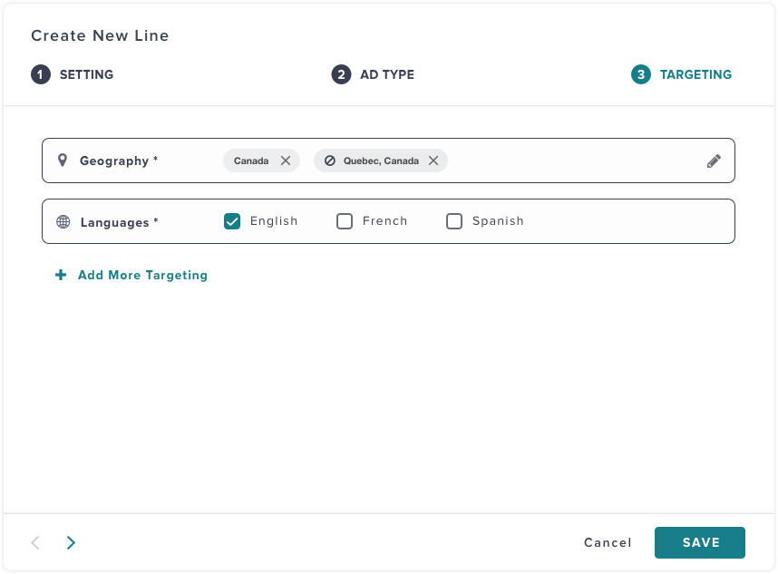
Only two fields are mandatory for targeting. The other optional targetings are now hidden away until it's needed by the user. With the optional fields hidden away, the setup process feels shorter and simpler.
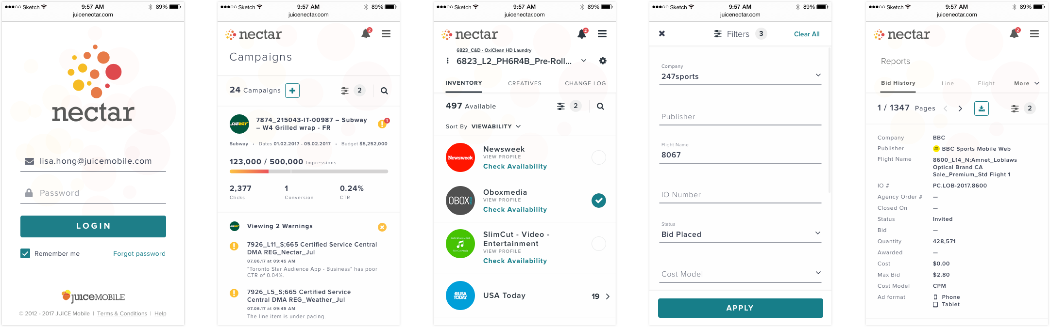
Mobile
As the redesign progressed, mobile versions were also explored. What functions are mandatory when the user is in mobile context and what are not needed?
Templating
As I progressed through more and more screens and see how the new header could work across all pages, I developed a master template.
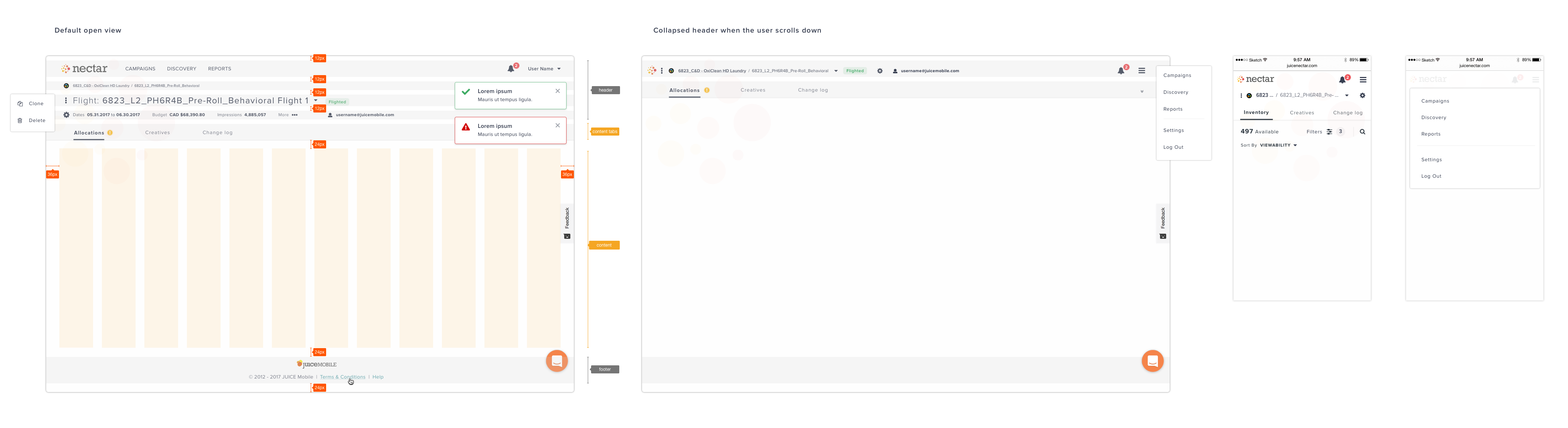
I also explored how I could further optimize the space issue on desktop and mobile. On desktop, I collapsed the header and info area when the user scrolls down so that more info could be available to them.
Next
What's next? Even more screens to be redesigned and to be user tested.