Nectar Publishers
Nectar for publishers has one primary user action: to bid or decline an auction. The publisher user group can view one or more auctions for different campaigns and set the price of their ad inventories by bidding. The auctions come from the agency user group who invite multiple different publishers to their ad campaigns. They set the price of maximum CPM (cost per mille, the price of a thousand ad impressions) and will allocate impressions to each publisher.
Problems
Nectar’s publisher relations team manages the ad inventory and regularly gathers feedback from the publisher users. The platform was deemed simple and straightforward to use but several pain points were revealed.
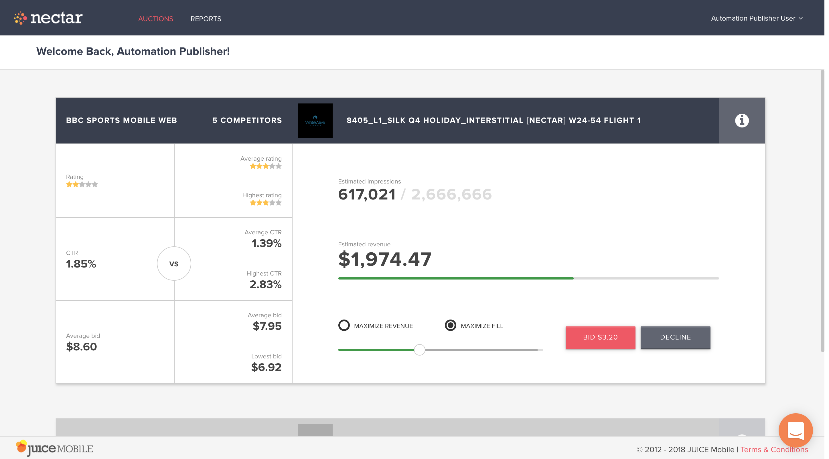
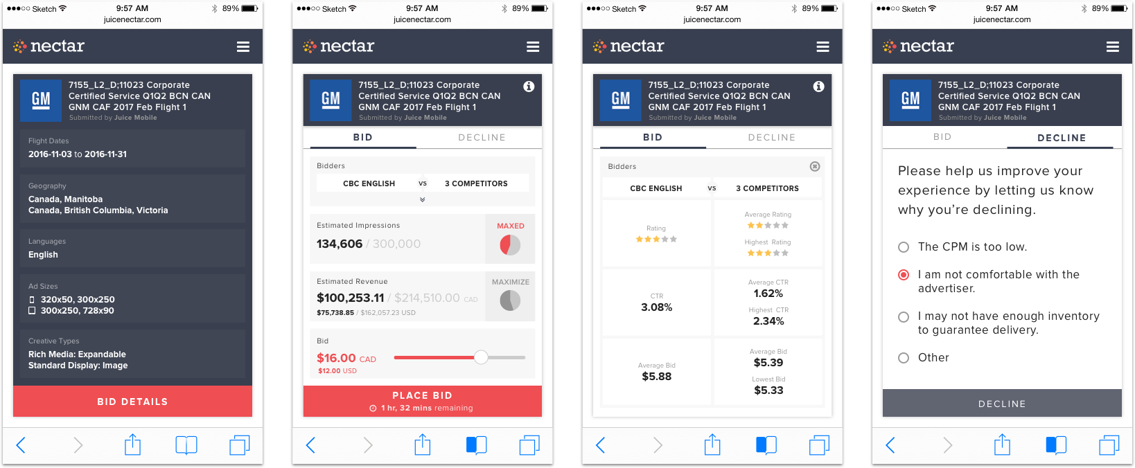
This is the current Nectar publisher bidding platform.
The users wanted to:
- See the information about the campaign upfront without clicking on the information icon.
- Know when the auctions would end so that they can plan their work day accordingly.
- Be able to bid on their phones. They receive the auction notifications by email and they wanted to proceed to the auctions without having to switch from mobile to desktop.
On the flipside, Nectar’s publisher team users also had frustration of not knowing why an auction has been declined or having no response at all. When Nectar’s publisher team reached out to the publisher users for the reasons for declining, frequently the feedback was that the deals were too small. For example, if there were any $100 campaigns coming in, they said it was just not worth their time to even respond.
MVP
Initial attempt to solve these problems was to work with the current design so that the technical lift would not be high.
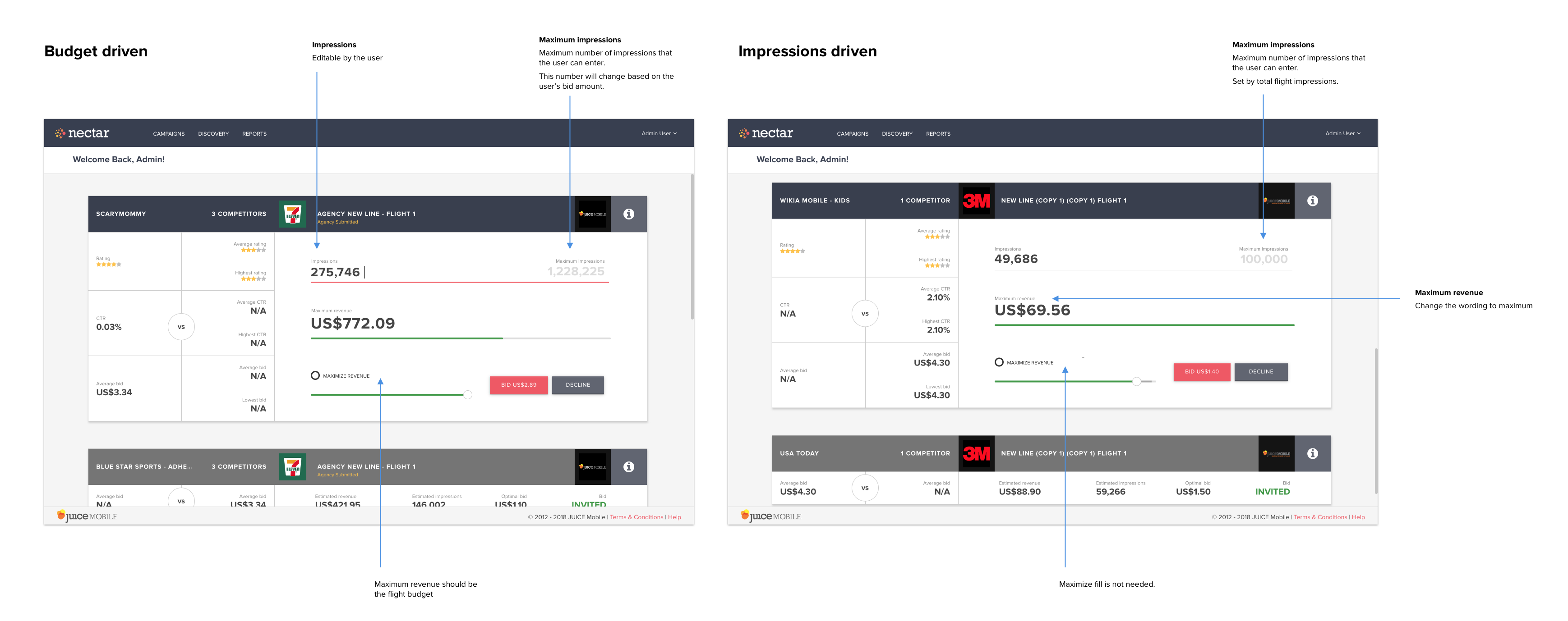
With MVP, we wanted to minimize redesign of current view but at the same time restructure how information is presented. We wanted the publisher users to know the maximum value of the campaign and do away with confusing estimated revenue.
Mobile First
In the meantime, I explored how the platform could be responsive.
Through the sketches and wireframes, it became apparent that heavier redesign would be required. If we go with simple collapsing of multiple columns into a single column approach, one single auction could become a very long page. Was this the best way to present a single auction?
How does the user go from receiving the auction notification to taking the action to bid?
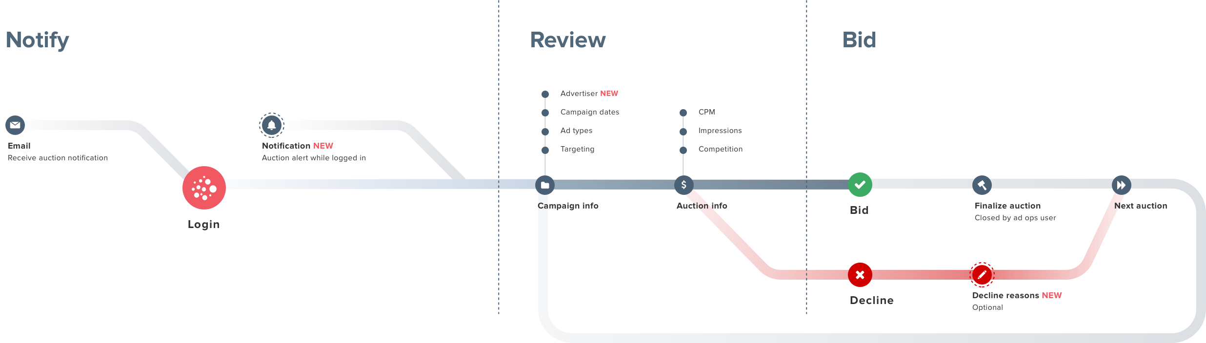
- Review the campaign information
- Review the bidding information
- Make a bid or decline
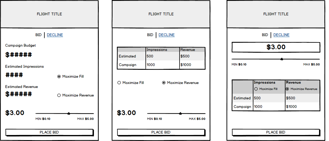
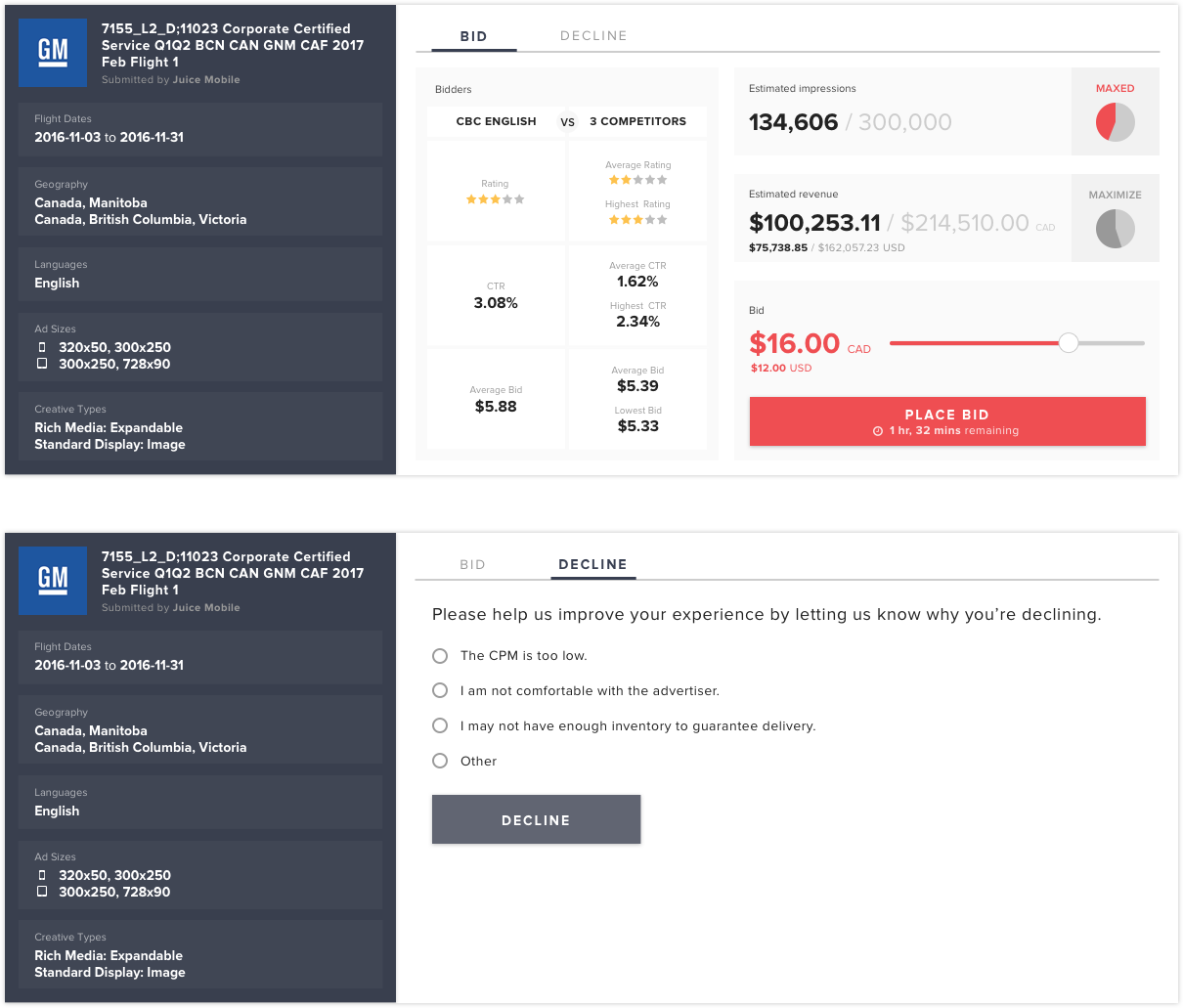
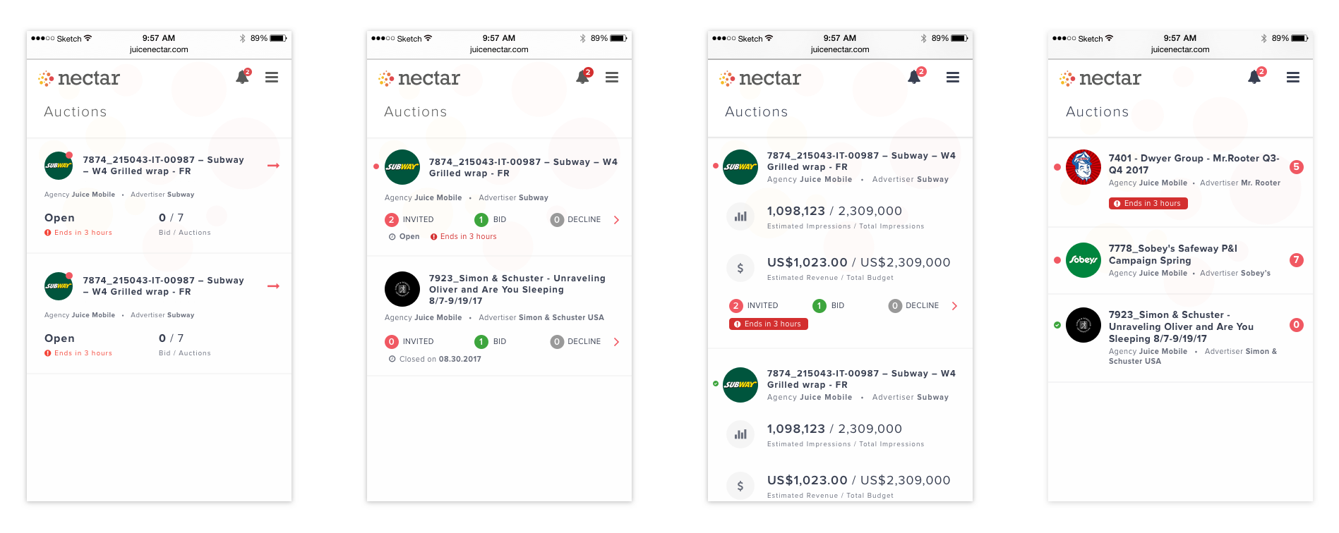
Each auction was now redesigned to be a single card and multiple auctions can be browsed through like flipping cards one at a time.
The first screen they would see is the campaign information - who is the advertiser, when is the campaign, what type of inventories do they want?
If they’re interested, they’re taken to the bidding information screen. How much impressions is asked for and what would be the bidding CPM amount?
They can either finish the task here, or go to the declining tab where they can decline and optionally enter the reasons for their decline. The reasons for declines has been gathered from the publisher user feedback.
Several new features were also added to address the issues that the users have raised:
- Expiry time for the auction.
- New auction alert system to eliminate the need to refresh the page.
- Feedback form to gather data about reasons for declining.
On desktop, the users are not confined to a small space. The desktop version presented all of the information they needed in the reading order, from left to right, still respecting the steps the user takes to complete the action.
Iterate
Further iterations were done with the following user feedback:
- Users wanted to be able to input the bid amount without having to fiddle with the slider. At the same time, they liked that they can simply swipe to the maximum amount with the slider.
- Users found that the auction competition information to be irrelevant to their bidding decisions. In many cases, some of the “competition” can be their own ad inventories since similar type of inventories would be invited to one campaign.
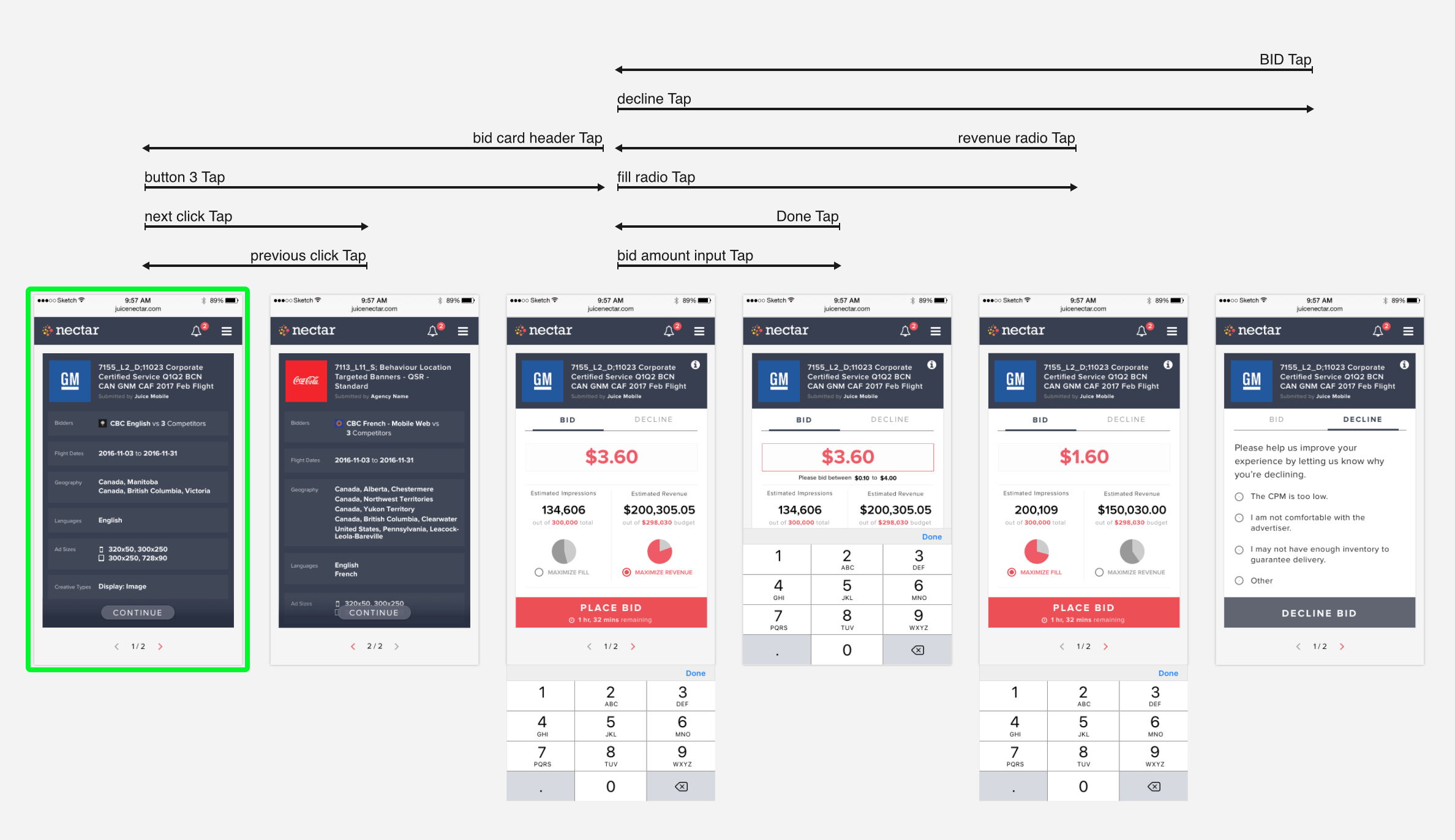
The new design became even simpler and stripped down to the info that the user wanted to see. Interactive prototype was put together with Principle to demonstrate how the new mobile screens would work.
Let's take it further
The redesign at this point has still been looking at solving the challenge within the space of a single auction.
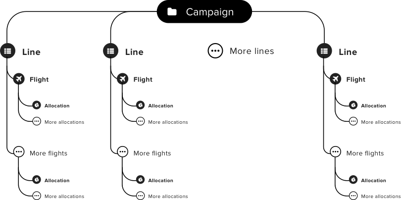
When reviewing the bid history data, it can be quickly gleaned that one user can receive multiple auction invites to a single campaign.
Currently a single campaign is organized into multiple different line flight items, based on criteria such as geographic targeting or languages. Since the auction platform was initially designed to display each auction as its own auction, the users do not realize that they may be bidding into a single campaign. All the small auctions can add up to more.
This revealed the need for even further restructuring of the auction. Nectar platform was going through a redesign exercise at this time and the new iteration of publisher screens also adopted the same visuals.
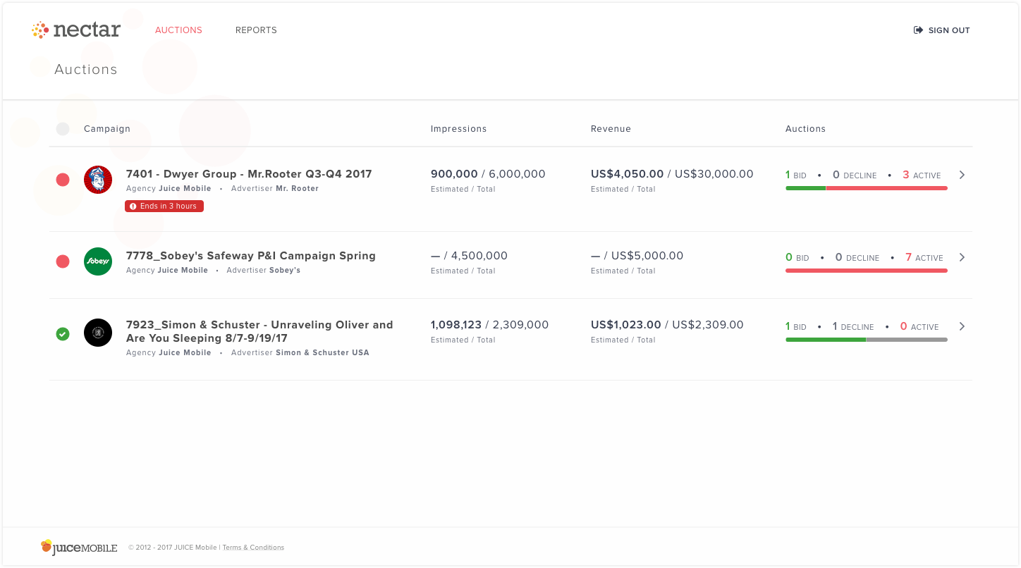
In this iteration, the auctions folded into a campaign. In tabular format, each campaign showed its own total impressions and budget, with a number of auctions per campaign.
Within a campaign, the user can navigate between different flights and bid. As the user bids, they will see the estimated revenue from the campaign increase.
Many different versions of the campaign listing were explored for mobile. Some were shelved for future A/B testing.
Reiterate
After another round of testing and feedback sessions, the designs were once again updated to address the following issues:
- The users found the navigation changes to be drastic.
- The change from a single page of auction to multiple pages of campaigns felt like more work.
- Revenue for each campaign needed to be more clear.
On the positive side, they did not have any issues with the bidding or declining process and loved they can see the revenue add up as they progress through the auctions.
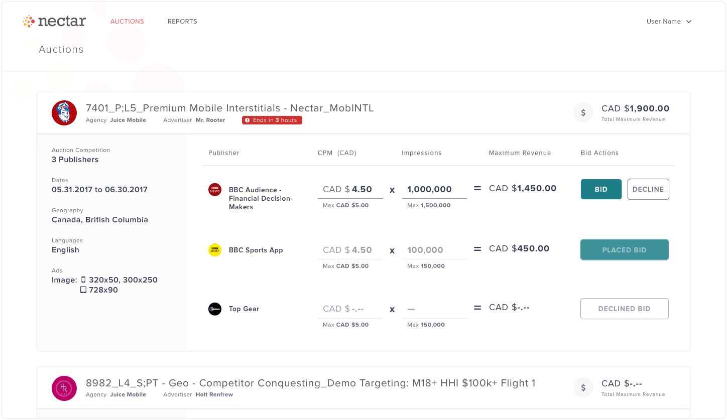
Desktop version has become a single page of auctions once again. While a campaign can have multiple flights, this use case is rare enough that we decided to focus on a single flight of multiple auctions instead. Each flight now displayed all the inventories in simplified tabular format so that they can quickly see the maximum revenue from each inventory, that will add up to the total flight revenue.
Instead of ambiguous estimated revenue, the user saw a simple figure of maximum possible revenue.

Mobile version still retained its card version as the users found the large input and buttons to be easy to use.
To be continued...